DJCAD Degree Show: Graphic Design
Situated at the top of the Crawford building, the bright and modern open-plan space exhibits the latest batch of budding designers. The graphic design segment of the degree show always lives up to the hype, so it comes as no surprise that this year’s students have had their successes recognised by the International Society of Typographic Designers (ISTD) – Susannah McGowan and Ruth Niven are awarded commendations, while Stuart Lamont and Katie McIntyre are given merits. McGowan has also been nominated for a Design and Art Directive student award (the D&AD being equivalent to the Oscars in the design hemisphere). If, like me, you’re a little obsessive about detail, and enjoy minimalism, faultless colour schemes and quirkiness, I recommend visiting this part of the degree show first.
You will be forgiven for thinking that graphic design involves only computers, but there are more skills used in augmenting computer-aided design which the exhibition displays: immaculate presentations of 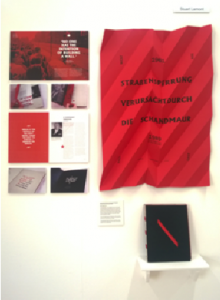 laser cutting, paper-craft, 3D design, editorial design, a variety of bookbinding methods, typography, screen-printing and motion graphics. The myriad of colour palettes chosen emphasises the diversity of the work produced. The ISTD brief, “milestones”, challenged students to produce a body of work exploring a person or subject key to our history, mapping in particular the significant milestones on that particular route. Stuart Lamont chose to focus on the Berlin wall: in classic white, black and red colour scheme (a minimalistic ol
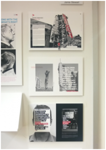 d faithful), Lamont displays a large 3D poster along with a book that utilises a perforated binding technique to “illustrate the ‘tearing down’ of the wall, by forcing the reader to tear open the pages”. Jamie Stewart tackles another serious subject in the same vein, answering another ISTD brief “taboo” – one that requires the students to explore the word typographically. Stewart addresses the conflict in Gaza, investigating genocide, media censorship and “bias propaganda” through editorial design, juxtaposing bold text with stark images, and employing that same minimal colour scheme to convey the uneasiness that comes with conflict. It is their meticulous research, and the attention to detail in their execution, that makes these project outcomes so successful.
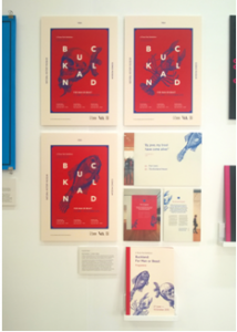 Lauren Millar’s eye-catching personal project, entitled “Buckland – For Man or Beast”, creates a visual identity for an exhibition celebrating the Victorian scientist Frank Buckland. In using a background of blood red for intricate blue illustrations of fish and skulls, all placed under white disjointed typography, she creates a professional and modern visual language. “Aftershock”, a personal project by
 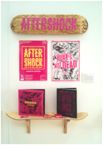 Danny McCormick, celebrates the history and legacy of punk in America and Britain. McCormick has screen-printed bold and vibrant posters, complete with a wall-mounted skateboard with neon pink lettering, to produce a grunge aesthetic.
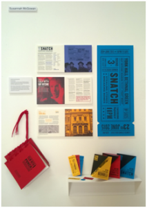 Susannah McGowan’s outstanding outcome for D&AD’s brief “monotype” required her to “use the power of type to create a new visual language for film advertising”. McGowan picked Guy Ritchie, an English filmmaker with a penchant for the crime genre. Her two “fight night” catalogues, bound with red shoelaces and hung up to look like boxing gloves, along with her leaflets, which are folded diagonally to literally reference the corners of the boxing ring, are testament to her completeness as a designer who takes care of even the tiniest details of details. In addition, in her D&AD film and her
 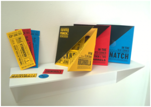 cheeky self-promotion video, both of which are well-thought out and professional, McGowan’s motion graphics expertise is clearly evident.
Designers have to be malleable, to adapt their working methods to each brief and come up with fresh and different ideas. All of the exhibiting graduates demonstrate their clear understanding of the language of design, and whilst some outcomes may be a little confusing they usually make up for this with copious amounts of charm. As high levels of excellence are evident in all of the work produced, demonstrating not only professional skills but an abundance of creativity, these are the “ones to watch”.
Sian MacFarlane
Leave a Reply