DJCAD Degree Show 2016: Illustration

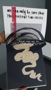
Victoria Stewart’s ‘Disordered Thoughts’
Illustration is a strange discipline, considered by many to be the awkward spawn of Fine Art and Graphic Design, and almost impossible to define. The annual DJCAD degree show provides the perfect opportunity to throw open the doors of the seldom-visited basement, showcase our “emerging talent” and attempt to answer that burning question: what is Illustration?
Most people may think of Illustration as drawing pictures for books – and sometimes it is. Fourth years are required to produce at least one book as part of their coursework for the year, but the format and subject of these vary enormously. One of books from the show was Victoria Stewarts’ ‘Disordered Thoughts’, an unusually bound book with various folds and windows. The pattern-based approach she takes to her work represents her minds’ wanderings in an effective and non-figurative way. Her folio shows a strong screen-printing practise with an emphasis on bold patterns and colours.
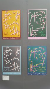
This abstract illustrative approach was also evident in Ronan Baxter’s excellent posters for Edinburgh Jazz and Blues Festival which capture the syncopated and unpredictable feel of jazz while also maintaining great visual harmony.
Clever and playful use of shape continued in Gabriele Gudaityte’s homage to French philosopher Albert Camus’ “The Myth of Sisyphus”; a hand-printed and hand-bound book that illustrates ‘Sisyphus’ monotonous journey’. Gabriele’s work was one of the stand-outs of the show; her folio is full of interesting ideas, notably her “Chelsea Hotel” project which brings together an archive of disparate elements such as a handmade wooden box, a rubber stamp, scraps of printed paper and a porcelain toothbrush, all coming together to mischievously illustrate various real and imagined happenings at the iconic New York hotel of the same name. Her “Absurd Reality of the USSR” project is a more personal account of her families’ memories of living in Soviet-occupied Lithuania, which is realised through a mixture of hand-drawn elements and photomontage, gifting the topic a certain lightness of touch.

Ronan Baxter’s posters for Edinburgh Jazz and Blues Festival
There is a clear comic book influence throughout the show with at least ten of the twenty-three participants utilising the form, many of whom also cite a lifelong interest in manga and video games. Elements of the show shared common ground with the Animation department upstairs, especially with the increasing popularity of digital drawing. The most original example of comic book work came from Craig Scott in his “Suicide Survivors’ Club”, whose precise line drawings told a story with a purity of expression as well as an element of humour, despite their dark subject matter.
Another impressive example of sequential work taking on a sombre theme was Sarah Burt’s “A Natural Death project”, which deserves a mention for its beautiful and peaceful portrayal of a decomposing corpse, presented without any hint of the macabre or sensationalism we would associate with depictions of death. The large-scale paintings are accompanied by a booklet which informs the reader of the choices they have to make about what happens to their body after death. Sarah utilised the School of Life Sciences’ anatomy department to produce an accurate yet stylised rendering of the human body after death.
I could keep writing indefinitely about the amazing work on show: Other pieces equally worthy of note are Caitlin Bowbeers’ wonderfully mad marble run, Poppy Powers’ ink drawings, reminiscent of the work of Andrzej Klimowski, Rory Carsons’ ceramic plates, Ellie Cliftlands’s beautifully detailed felt work, and Jacqueline Briggs’s watercolour portraits.
With such a variety of work on show, this overview has probably confused any answers to the question I originally posed. But, perhaps that’s the whole point of Illustration – it defies easy categorisation and can be whatever you want it to be.
Jennie Bates

Leave a Reply