Graphic Design
The Graphic Design degree exhibition showcases a range of highly effective work in a great array of styles. Some of the most interesting works on display have been produced for the Student Assessment Scheme organised by the International Society of Typographic Designers. The society has a worldwide remit to create and inspire interest in all forms of typographic communication. It supplies a number of briefs each year, from which the students select one to test their abilities at marrying design skills with typographic presentation. One of this year’s themes was “Anniversaries”, and the students who chose that brief have produced a number of interesting interpretations of anniversaries of such events as the plane crash, which killed Buddy Holly, or the release of 2001: A Space Odyssey. Another theme was “Mark my Words”, an opportunity for students to explore the development and meaning of a selected word.
A standout display on this theme is Jamie Stein’s publication on the idea of the “meme”. Far from being simply a fashionable trend, the origins of the word and the idea reach back to ancient Greece. The pages of the publication, which attractively combine text with imagery of philosophers, scientists and others who have explored the idea of the meme, are arranged in a way that demonstrates the development of the word and allows for possible future additions to its meanings, as it is in a ring binder constructed from scratch by the designer. While this work fulfils the brief accurately, it is also noticeable that it has an aesthetic which is consistent with the rest of this student’s work: bright and zingy.
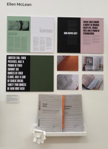
The tone of Rebecca Scouler’s work is more muted but equally effective. Selecting the theme of “Anniversaries” she has chosen to work on the one hundredth anniversary of the Spanish flu outbreak which killed so many people in the immediate aftermath of the First World War. Her subdued palette gives her publication the air of an old official document, secured with flat bar clasps. It is worth noting that the students who enter these categories carry out all their own research on the topics, assembling a substantial amount of written material on which to base their tests of their typographical abilities. A final example in this category is seen in Ellen McLean’s Cereal Killers, a presentation of the last meals of prisoners on death row. Again the format reflects the subject, being laid out like a prison case file, although the meals themselves are presented in bold. This gives an immediate appeal to the senses, and an ironic contrast between the delicious-sounding ingredients and the circumstances in which they are being consumed.
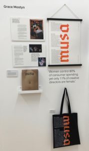
 The works produced by the students for their personal projects have a somewhat different tone. It is easy to see people’s personal interests shining through as opposed to their working to an external brief. Tom Heggdal Lønes has taken the well-known comic character “Beryl the Peril” and redesigned her for modern times, setting her loose to explore interesting sites in Scotland. The result is a small and lively comic book. Darryl Gray explores the vinyl revival in LP Me, a project that is designed to encourage the sale of vinyl in local retail outlets, while Ellen McLean produces personalised skateboards. Grace Mostyn has explored the gender disparities within the creative industries, with a range of products including bags, wall hangings and publications, while Olivia Annand seeks to reconnect young people with the world of nature.
A small criticism of some of the works on display would be an occasional lack of effective proofreading; designs that depend on words really need to ensure accuracy at this level of study. Overall, though, this is a small matter within the much larger impression of a cohort of imaginative creatives producing visually stunning work.


Leave a Reply