Illustration
The Illustration Department’s show can be located on the lowest level of the Crawford building in a pair of studio rooms with walls lined with prints and pedestals tendering ceramics, woodcuts and textiles. The sleek polish of the comic books, books and even beer branding has the air of a commercial showcase. An industry consciousness is very apparent in the choice of work on display – the studios feel like an illustrator’s conference, touting skill, range and imagination. However, this is not to diminish the quality of work in the department; everything is expressive and of an excellent standard, particularly the comics and cartoon prints.
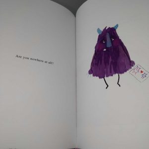
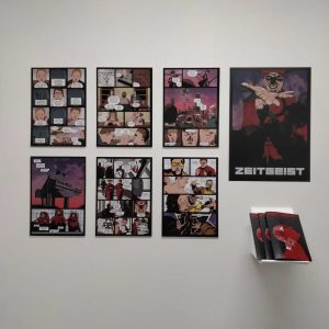
Narrative, though not consistently demonstrated across the department, is a recurring theme. Nicola Henry’s “Inside A-Z” is a series of vignettes in postcard form. The postcards are collected in a box ‘tenement’, depicting scenes from the people and rooms inside, and can be arranged in any order to generate different stories. Comics and cartoons are represented in various formats throughout the show, but Kyle Irvine’s comic “Zeitgeist” is presented in a traditional serial storytelling format. His colouring work is bold and dramatic, and his writing deals with some dark themes. Several students have written and illustrated books for children, including Lucy Dewar’s “Are You There?”, the latter an evocative and vibrantly illustrated monster story about family. Dewar’s work is primarily digital and she demonstrates a mature awareness of emotion, and a definite talent for character.
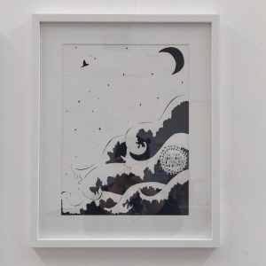
Digital illustration is perhaps the most common medium in the studios, yet perhaps not the most impressive. Chirsty Bennett’s entry into the Fumetto International Comix competitions is a triptych of meticulously hand-cut paper pieces. In response to the question – “Enough. What is enough?” – Bennett has chosen to depict images and passages from Ecclesiastes in a style that recalls Hokusai’s “Thirty-Six Views of Mount Fuji”. Visually, the pieces work very well. The monochromatic paper is striking and the muted tones feel appropriate for the ukiyo-e print. Though incongruous with the regional style, cursive Arabic script sits comfortably among the ferns and birds. The presence of a Christian biblical verse in the centre of an Eastern influenced print sits a little uneasily, especially since Bennett’s “Enough” at first seems to be a comment of environmental issues but, very likely, deals with more philosophical themes.
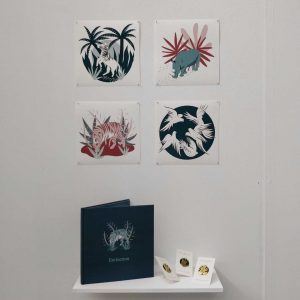
Political concerns are another recurring theme. Jade Gilmour’s work is bluntly political, depicting satirical illustrations of Donald Trump and Theresa May. Emma Fraser Reid’s collection titled “Extinction” more subtly explores conservationism. Reid’s collection includes brass pins and an illustrated book depicting animals that have become extinct because of humans. The tiger on the cover and jungle foliage are reminiscent of Kipling’s Jungle Book which, for me, inspired another degree of melancholy to the already gloomy subject matter.
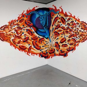
The pièce de résistance is Andrew Smith’s “Malaria”, a vivid anamorphic piece that plays with perspective and space. “Malaria” was created in response to the University of Dundee School of Life Science’s research into curing and reducing the transmission of the infection. Smith’s work has a preoccupation with perspective and natural geometry which is evident in the exploration of cycles and layers as of his animal studies. Visitors must take care to read the viewing instructions to get the full impact of the anamorphic design. This was a little difficult both times I visited, but the work is striking and the illusion impressive even when partially experienced.
Leave a Reply