V&A Dundee: The poetry of buildings, the poetry of objects
 At this year’s spring exhibition of Danh Voh’s photographs and sculptural installations of found and preserved objects at the Guggenheim in New York, I felt, viscerally, for the first time what had merely been an abstract idea: the rhythm of buildings, the poetry of objects, the stories that reside within, the narrative webs they are part of… assemblages that quicken and uplift, uplift and quicken. Yesterday morning, I was lucky enough to walk into the spaciousness of the new V&A atrium, lit within from the sunlight that was in good supply outside, for the press previews.
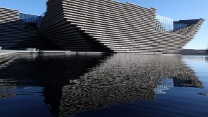
Outside on the street, or at a distance across the river in Fife, the V&A building has an imposing greyness, even though its monumentality is tempered by how the eye strikes those horizontal lines, striations of light and shadow, in its concrete facade. It seemed to me then that this was a physical brute of a building, despite occasional dainty curves, or the coy River Tay peephole at the railway station end of Riverside road. But yesterday, inside, it was glorious: a revelation of wood, glass and metal, rising up vertiginously when riding the lift, from the blue-black limestone floor embedded with fossils to the stripped down wood panelled upper floor and overhang balconies where, as in a theatre, you can feel like an Olympian god looking down on activity in 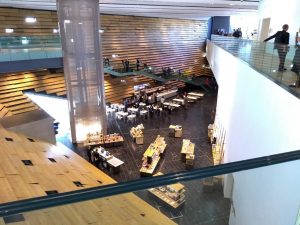 the foyer below. The grand theatrical staircase, wider at the bottom than the top also adds to this impression. Close up, and inside the building, you understand that monumentality is built up from the putting together of small things. The long stone beams outside are cast from concrete that contain small stones and particles to give blocks texture so as to render them less industrial; the narrow but visible seams between each block testifying to a process of assembling, and the light filtering through the glass-backed gap between each beam make the building seem more porous. The natural is also present in the manufactured, the shape of individual concrete units themselves reminiscent of the thatching
 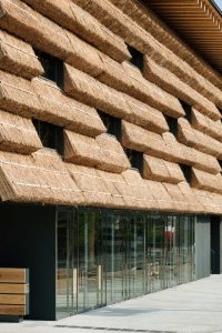 structure of the roof of the Yusuhara Machino-eki, one of the architect’s other buildings. Everywhere there are lovely echoes, the shape of the concrete units outside are more delicately reiterated by assembled display of rectangular oak wood leaves, where light also enters via apertures placed strategically as peepholes. Inside, the overwhelming impression is one of airy space and light; viewing platforms and slot windows, connect inside to outside, land to water, and the very building to the hills and city beyond.
After the requisite celebratory speeches, I sat in on two Q&A roundtable sessions with Kengo Kuma, who despite his superstar status, seemed soft-spoken, unassuming, and at times bemused by the questions asked. His eloquence is evident in his answers to questions about his building and its compositional processes, and in the analogies and metaphors he uses that render the materiality of the work as also delicate, thoughtful and philosophical. Music and sound were used describe the building’s rhythm (an undulating soundscape of light and dark, small building blocks, curves as well as straight lines rather than a monotone breeze block casting); particle (the small stones cast into concrete) as musical notations; apertures and spaces as pauses to break up solidity. The building’s monumentality outside is counterpointed by the warmth and 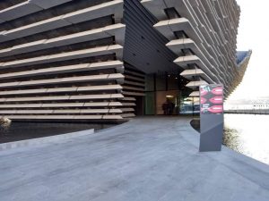 intimacy of its interiors (also described as “the living room of the city”), the twists and curves within matching those outwith. Kuma made comparisons with Japanese traditional architecture, a love of stone’s solidity as well as lighter materials such as wood and glass; Shinto shrines gateways and doorways (torii) that invite visitors are present in the V&A open archways. He also spoke of Scottish-Japanese interconnections and intermingling in his design: rock/cliff formations, Charles Rennie McIntosh’s meshing of Scotland and the decorative Oriental. Curious, I asked Kuma about the relationship of language – story, narrative, metaphor – to architecture and the building of the V&A, and was heartened by his response: language can give you “hints” about the design… the way that architects use language ‒ their vocabulary ‒ can make a difference to the philosophy of design, as much as it explains the uniqueness of the built structure itself. I thought then that there is poetry in the language of buildings, and buildings as language.
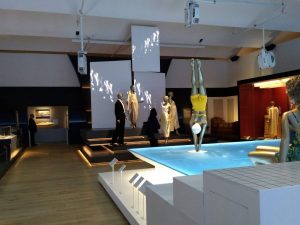
 The two gallery spaces housing Scottish Design and Ocean Liners: Speed and Style also counterpoint each other. The latter includes objects, clothes, furniture, marketing posters, film and painting from cruise ships as grand luxurious floating cities tell heady stories of beauty, design aesthetics and engineering, but also the history of Empire, wealth and privilege, and the invisible Atlas-like labour that goes into holding up such grand displays. Walking through these stories is a leisurely stroll through history, the grandeur and the spaciousness of these liners are reproduced in the exhibition’s spaciousness – this is no cramped living room but one that reproduces the experience of being on these ships, including cinema and mock swimming pool. The Scottish Design gallery, in contrast, is impressive in delivering the warm intimacy of the “living room”. Its first room contains the requisite glass case displays of objects – textiles, linoleum, ceramics, chairs, a pair of Wellington boots and even part of the fireplace and mantelpiece from Northumberland House, complete
  with its large mirrors and decorative trims. As you look up, the “inspiration wall” is a vertical display of costume, posters, decorative objects, posters and furniture, a Joseph Cornell box of magic, where your eye
 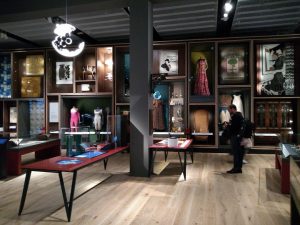 is drawn to the visual feast that is colour, surface, texture and pattern. Following the layout of the room, you pass the famous Charles Rennie Mackintosh’s famous oak room for Mrs Carnston’s tearoom (hived off for filming when I was there), and the curve path of side walls that exhibit more contemporary Scottish design stories – medical devices, instruments and technological innovations, video games, and The Beano art work. This gallery room contains the poetry of objects, evoking, like Cornell’s boxes, less tangible things – desires, memories, and stories of how and where the objects came to be – even in their materiality, their thing(y)ness ; ideas fleshed out, ideas also experienced in the flesh.
The gallery spaces may account for the V&ADundee’s presence in Dundee, but Kuma’s promise of building for the city and the community is matched by the areas given for flow and interaction outside the galleries, both in the foyer and on the upper floor of the building. Add rooms for learning and working, this is a building for the city to own and to inhabit. The V&A Dundee is resolutely internationalist in outlook, connecting Scotland – Dundee – to the wider world, and this must be a good thing. Dundee’s time has come and we have waited so patiently for it. Yet, for me, it is to see poetry in the built environment, and in objects that uplift and quicken, that made me so so very glad.
(Ed: an interview with Kengo Kuma on these pages can be found HERE.)

[…] The Japanese architect, Kengo Kuma, in conversation with Susan Nickalls, a freelance journalist and former student of the Writing Practice and Study programme at the University of Dundee, on the design and building of the V&A Dundee. The interview was filmed at Discovery Point. DURA is grateful for the use of Discovery Point Premises. A review of the building and galleries on our pages can be found HERE. […]