DJCAD Degree Show 2019: Graphic Design
The Graphic Design presentation for this year’s show is tucked away from the rest, occupying a room within its own corridor on the 4th floor. The display is built up of nooks and alcoves – emplaced walls holding the students’ work and driving visitors around the room, creating a blur of prints, slogans and colours at first impression.
The busyness of the displays is an effect of the subject matter, as well as the room’s layout. Everything in the exhibition is trying to stand out and attract attention, and indeed its effectiveness there could be considered part of the designer’s success. All students are exhibiting printed work, but many have employed other media to showcase their designs. Video screens populate each booth, usually iMac units running animations or slideshows to complement their relevant projects. Others have gone further, printing onto physical objects such as bottles, t-shirts or sample packaging. Veronica Hamilton’s NOT A DEBATE includes picket signs and a printing kit with stamps, whereas Daniel Walpole’s Nott’s Nightmare, features a playable video game, displaying his character art, with a printed cover sleeve and disc.
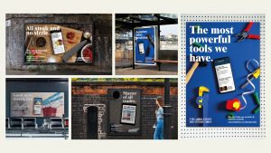
Where Walpole’s project was illustrative, the clear emphasis across the exhibit is text – infographics, advertisements and manifestos are thick across the walls, revelling in crisp fonts, balanced layouts and sharp colour schemes. Looking closely, it becomes clear that many of these are submitted off the back of the International Society of Typographic Designers’ Student Assessment Scheme, hence the heavy presence across the room. Although there are personal projects, driven by the student from start to finish, the works on display are generally sourced from similar third party briefs, including Royal Society of Arts awards or the Design & Art Directive’s New Blood competition.
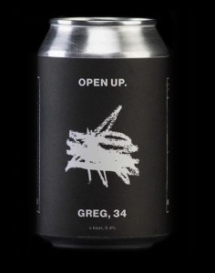
The D&AD project came pre-built with corporate partners, meaning the same logos, fonts and branding reoccur a few times across the exhibition. Companies such as Durex and Bacardi have multiple examples, but most noticeable are the crimson displays of work by students, having taken their brief from Heinz. Louis Peters’ mock-up of a ketchup vending machine strikes a humorous chord, amidst the bold taglines and posters. Peters’ personal project Open Up leads into another of the exhibition’s motifs, featuring beer cans adorned with scribbles and a printed carton to match. Where brewer Adnam’s came in with the D&AD collaboration, several students have invented their own alcohol brands to lead with. Iona Sorbie’s ‘Wild’ Beer slaps bottles with puns and cool colours, whereas Shannon Graham’s Alcohol Branding project carries rich, earnest tones that would fit into any country pub. Concepts for various rums and whiskeys pop up around the room, playing happily to the classic student preoccupation with drink.
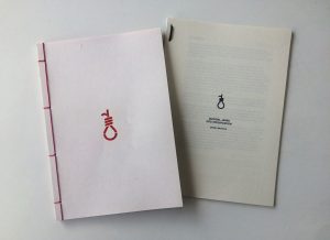
The commonality of techniques, approaches and inspirations across the exhibition makes it difficult to identify works which really stand out, without feeling incongruous. Small differences become significant – Graeme Robertson’s United States of Mind MKUltra Exhibition catches the eye by dropping colour, instead printing in a sharp black-and-white. Claire Polloch has built a clever interactivity into her display, using sliding screens that obscure text about visual impairments. My thoughts go out to Zara Elmi’s The Line, for which the designer has made a model smartphone to frame a screen, but also affixed part of her display to the floor, where it will certainly be kicked up and destroyed before the exhibition’s close.
Graphic Design is a subtle art, the creations intended to fit into everyday life. The practicality of their craft robs it of the flare found in, for example, the fine arts displays. However, while it would be easy for many visitors to skip this part of the show, that would be a mistake. Across the board, the students’ technical proficiency is clear. If few of the pieces stand out, that’s because the overall standard is so high.
Jed Edwards


Leave a Reply