DJCAD Degree Show 2023: Illustration
Mathew Building
19 – 28 May 2023
This year’s illustration graduates display some common themes which reflect their style or inspiration. While all of the work of any individual may not necessarily be bound by these groupings, this structure may lend clarity to their descriptions.
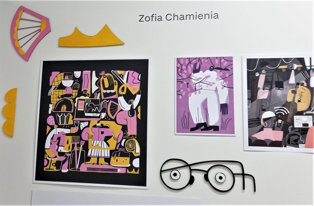
Graduates using bold, graphic styles include Zofia Chamienia’s use of flat, contrasting colours creates a collage-like effect, with bold colourways such as hot pink, orange and white on a black background. Her simplified figures are full of lively movement and energy. Tia Fox has created a beautiful set of large, wooden 2-d images of dinosaurs, to complement her informative children’s book. Her use of intense, dark greens and browns creates a sense of weight for the reptiles and gives the illusion of a natural environment for them. Chloe Gardiner’s simplified and amplified female figures lounge around in oversized comfy clothes, sipping tea or trying on outsize jumpers. Her playful use of line and colour create friendly, comforting scenes, which would be very effective in magazine or blog illustrations. Erin Tosh’s work comprises digitally produced illustrations using strong, flat colour and clean shapes. She also makes large multi-media fantasy creatures with comically weird anatomy. These could translate very effectively into cuddly toys.
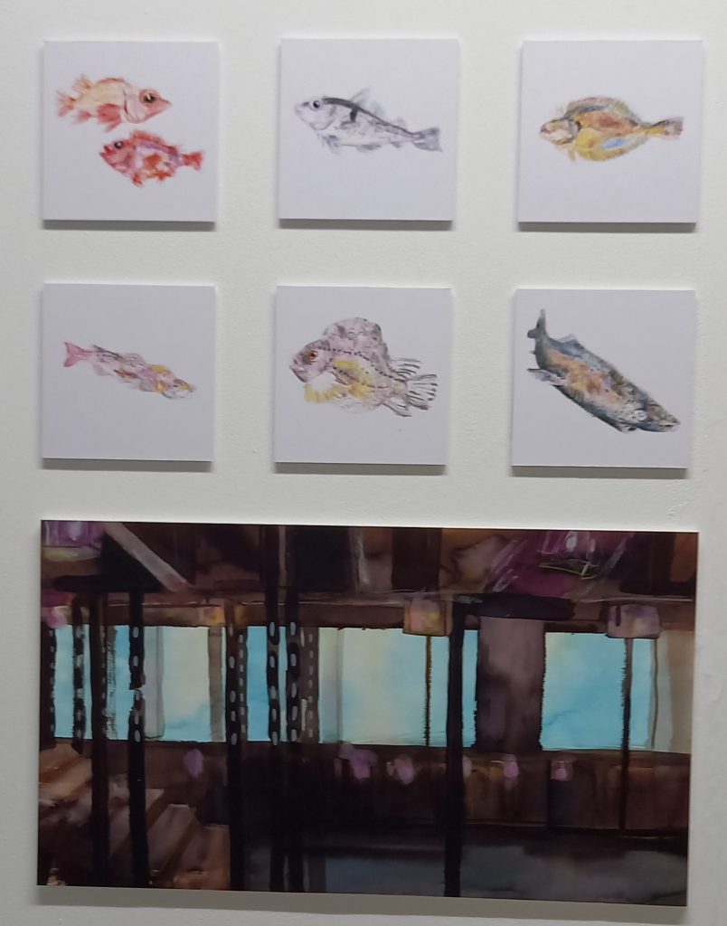
Using painterly strokes, Jane Barker’s delicate landscapes use clean bright colours for a children’s book illustration. She has also illustrated a non-fiction book for children on the subject of food production. Again, she uses clean, bright washes of colour to convey natural settings such as a vegetable garden. Maria Stella Faccin draws on figure drawing and natural history, to produce delicately coloured line drawings of fish, the sea and the small boat fishing industry. She has also produced a Cubist tea set, in bright purple and yellow. Tess Hadoke’s humorous caricature animal paintings are executed in bright, jewel colours. Her drawing is skilful, with a good sense of movement. She has also created a ‘Dial-a-Mood card’ in collaboration with the V & A, using 15th century images of faces with different expressions. Alice Li’s digital images take inspiration from Asian culture and history. She creates landscapes or indoor environments using intense deep colour and flowing lines. Jillian Mendoza (AKA Mendonka!) uses pastel watercolour effects in her kitchy, playful map of Govanhill, which is populated with buildings, streets and people.
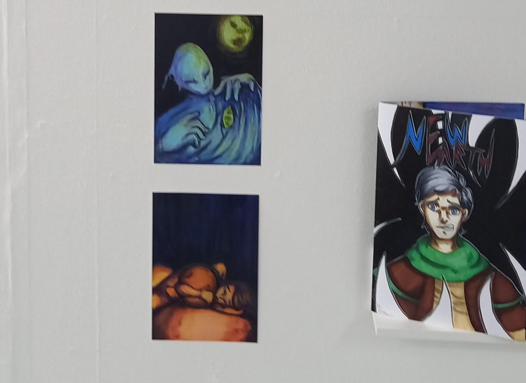
In the fantasy or gothic style, PJ Fairweather employs gestural washes of reds and pinks for her Gothic Vampire-themed comic book, ‘Madeline was Biting’, which manages to look dark and yet playful at the same time. She uses a cartoon comic format depicting a grisly tryst between Madeline and her victim. Cameron Glen paints fantasy landscapes in bold colours. His skilful imagery is a backdrop for an intriguing story, ‘The Art of Hemlock’, which has a beautiful title cover featuring a traditional Japanese gate, with a mysterious warrior standing in the doorway. This is contrasted by a much more graphic image using bright, flat colour.
Also featured were works inspired by games and comics; Casey Brown creates action heroes with a painterly feel, while retaining the boldness of comic strip figures. His use of browns and purples lends a moody intensity to his characters. Chloe Drummond uses a much more graphic, stylised method in creating her figures. She shows great skill in portraying the dynamism of the body through fashion illustration. Jiawen Gu’s dynamic scenes of surfing children, accompanied by cute ducks and other aquatic creatures convey a real energy and sense of fun. The imagery would be effective in books for younger children. Leo Lincoln takes inspiration from comics and cartoons, fusing watercolour and coloured pencils to create a feelgood imagery that includes socially inclusive wording and characters who are often ‘outsiders’. Gracie Whitehouse creates zines, comics and graphic novels. She has created a graphic novel, ‘She Will Burn’, about a relationship break-up, in which the illustrations employ a muted colour-palette of greys and pink, echoing the sombre nature of the narrative. Her zine series, ‘The Innocent’, focuses on women in Greek myth.
Jenny Gorrod


Leave a Reply